Project
Name
QuickFisco
Deliverable
UI/UX · iOS and Android
Year
2023
At a glance
Duration
3 months
Screens
~30
The starting point
The web platform was already released and simultaneously being redesigned by another team. A few alignment calls gave us their direction, and we worked from that, knowing parts of it would keep moving while we designed.
The real problem
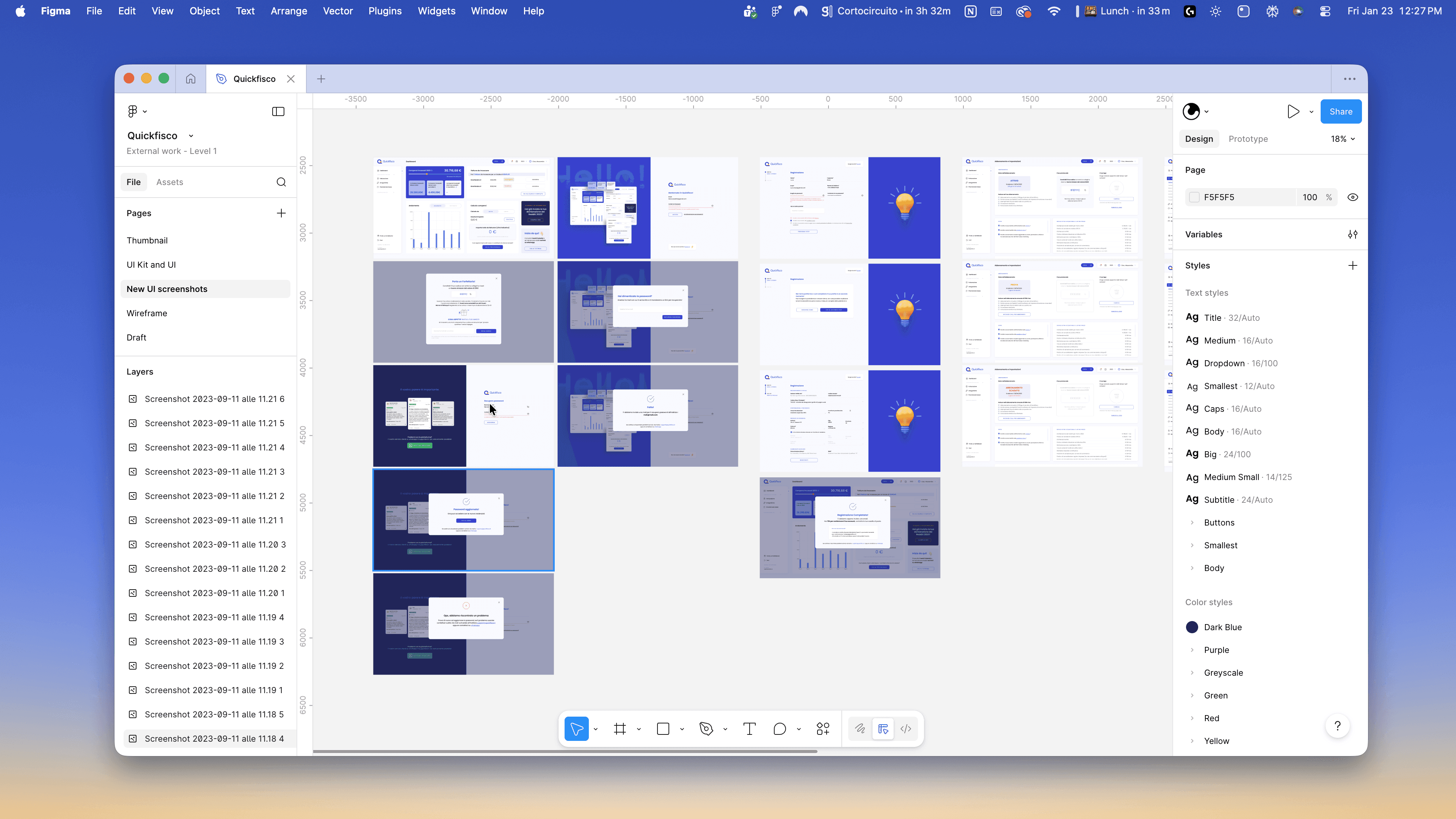
A desktop page can hold a lot of data at once, and QuickFisco’s did. Invoices, filings, thresholds and totals all shared a screen because there was room for them.
On a phone there isn’t. So rather than shrinking those pages, we broke them into sections, each one carrying a single focus, and decided, for each view, what a professional actually needs to see first when they open it on the move.
Decision
The web put navigation across the top. We moved it to a bottom bar, not for novelty but for the opposite reason: it’s where every other app on the device puts it, and an app about tax deadlines is not the place to make someone think about where the buttons are.
Design system
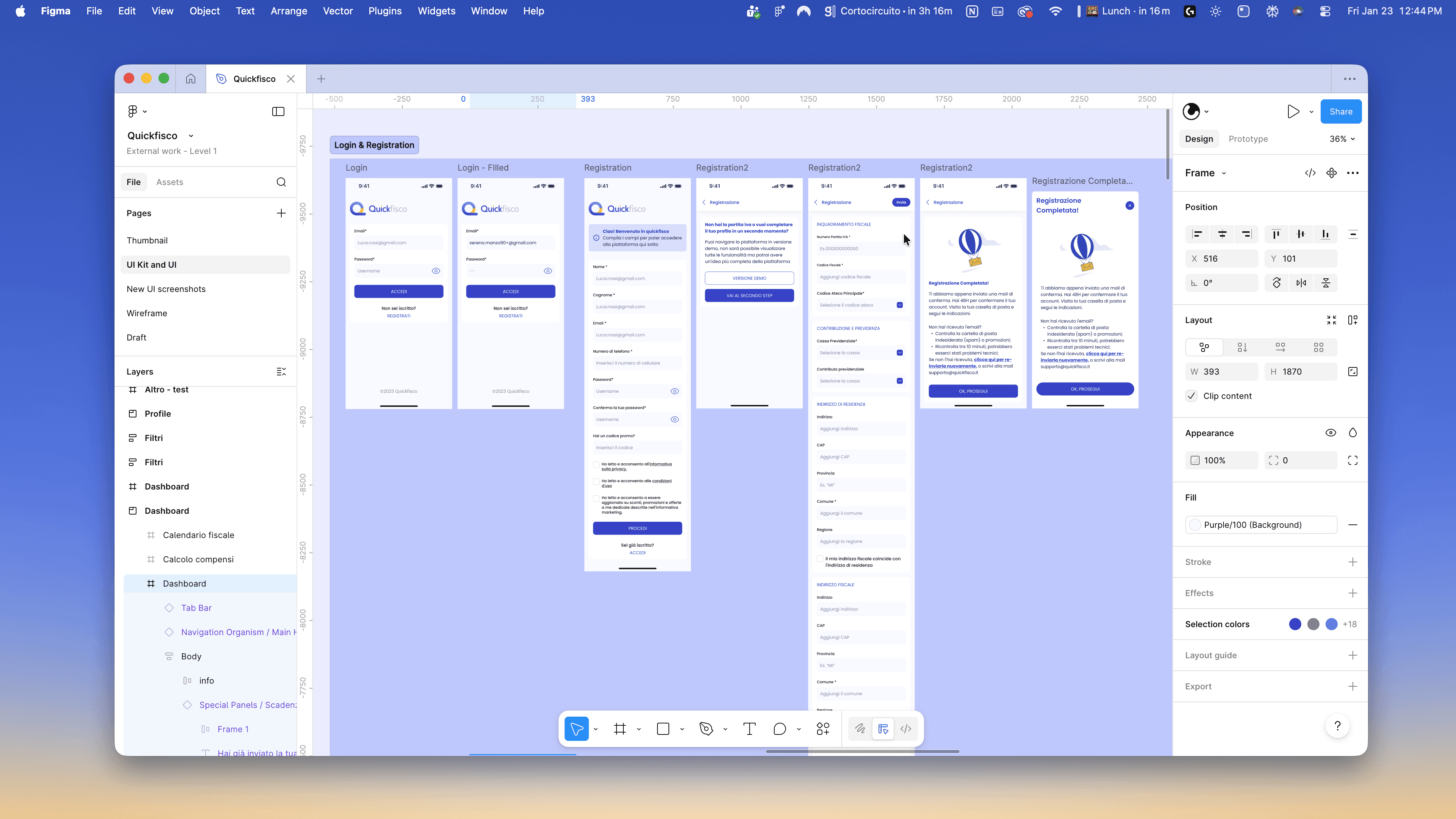
Colours, typography, buttons, bars: built as reusable components alongside the high-fidelity screens. Thirty screens designed one at a time become thirty separate decisions; built on components, they stay one.
Result
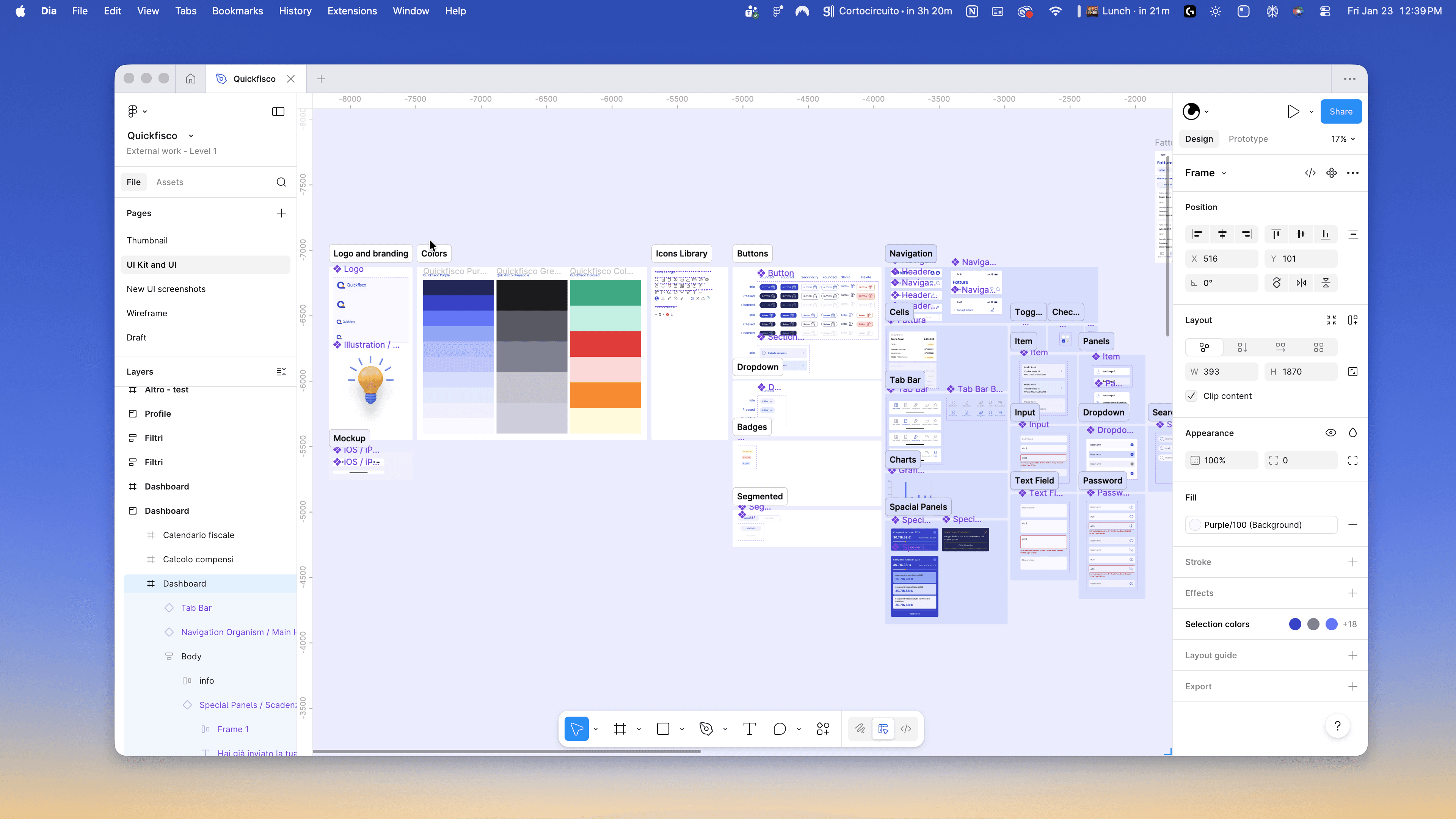
Published on the App Store and Google Play. We reviewed the work with the developers and the platform owners through several calls, and stayed available during development.