
Project
Name
Italgas
Deliverable
UI design · Client design system
Year
2024
At a glance
Duration
6 months
Users
Thousands
New components
~10%
The brief
Sections were working fine. Nobody used them, which makes for a more challenging brief than making something work since there’s nothing to fix. The task was to design an internal tool worth visiting on one’s own volition.

The constraint
Italgas had an extensively thought out design system. It existed in Sketch and deliverable had to be in Figma.
This is why we studied it thoroughly first not to replicate every component but to learn its logic and manually create the missing pieces. Anything else would lead to delivering a product that looks like Italgas but doesn’t behave that way.
The process
That order looks backwards. It worked because the system had already settled spacing, hierarchy and component behaviour, and knowing those answers in advance kept the wireframes from relitigating them.
Decision
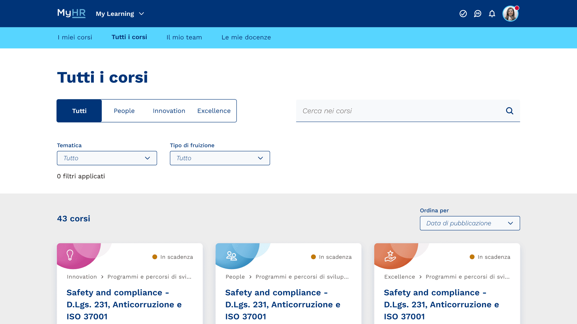
About 10% of what we needed didn’t exist yet: larger tab sizes, a new size step, the main cards. Each one was a conversation with Italgas’s internal Design Lead, and the conversation was always the same: how do we add this without adding a variant.
We disagreed often, and usefully. A new size in a design system is not a local decision: it propagates. Some of what we proposed was adopted into the system itself and is now used beyond this project.

Result
Delivered and live across the company. Italgas maintains it internally, on a design system that now includes components we drew.


